
Logo for an Interior Design and Renovation Studio
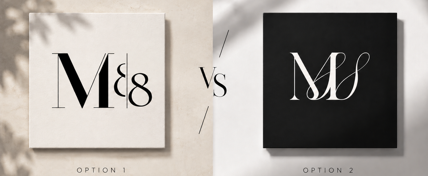
We break down a logo design case for an interior design studio: two takes on the M88 monogram — the designer's pick and the client's pick. How a brand mark comes to life.
Read this article in Russian →
And which logo would you have picked?
In logo and brand-book work, we run into the same thing again and again: our professional eye and the client's taste don't always line up 😅 And that's normal — every choice has its own logic behind it.
We're showing 5 monogram options for a brand in interior design and renovation.
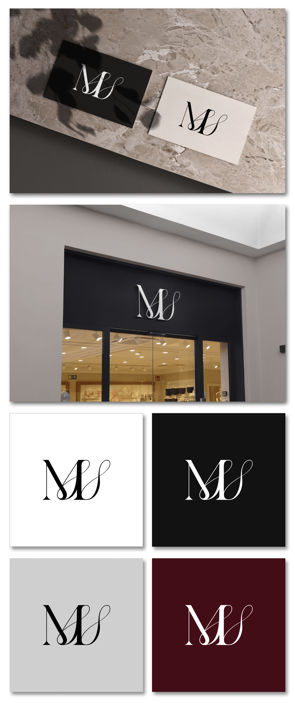
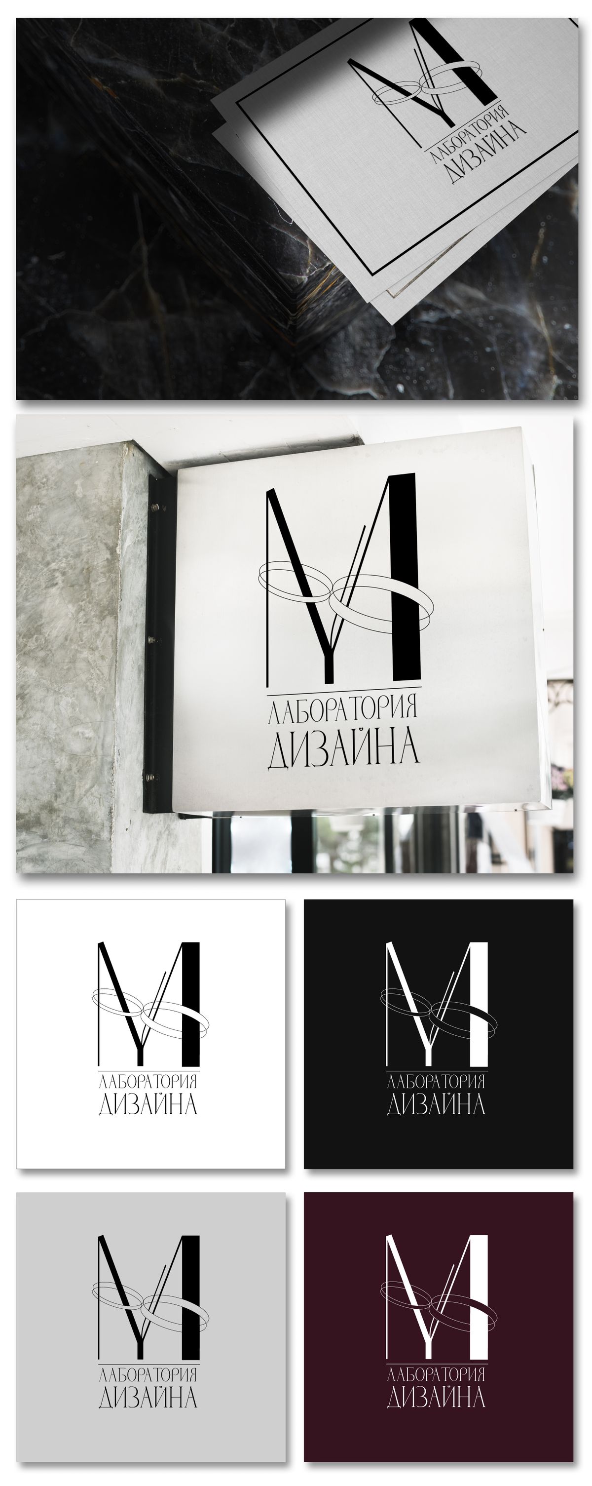
Our pick — interlocking letters M and S with smooth, calligraphic lines. Here the letters ‘flow’ into each other, forming a single unified mark. This kind of monogram reads as a premium symbol: it evokes handcrafted work, attention to detail, and a personal approach — exactly the qualities that matter in interior design. Thin strokes and high-contrast serifs add elegance and an expensive feel.
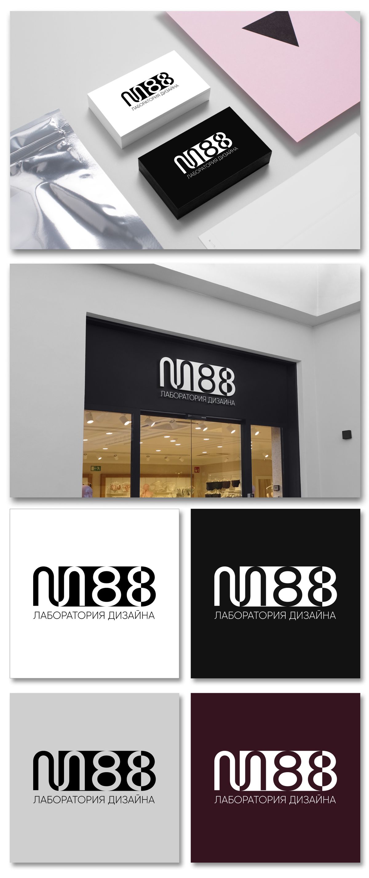
The client’s pick — a stricter, more graphic solution with a clean, sturdy letter M. It reads faster and more confidently, and works better at small sizes and on signage: the logo doesn’t get lost from a distance and is easy to recognize. This is a choice in favor of practicality and function.
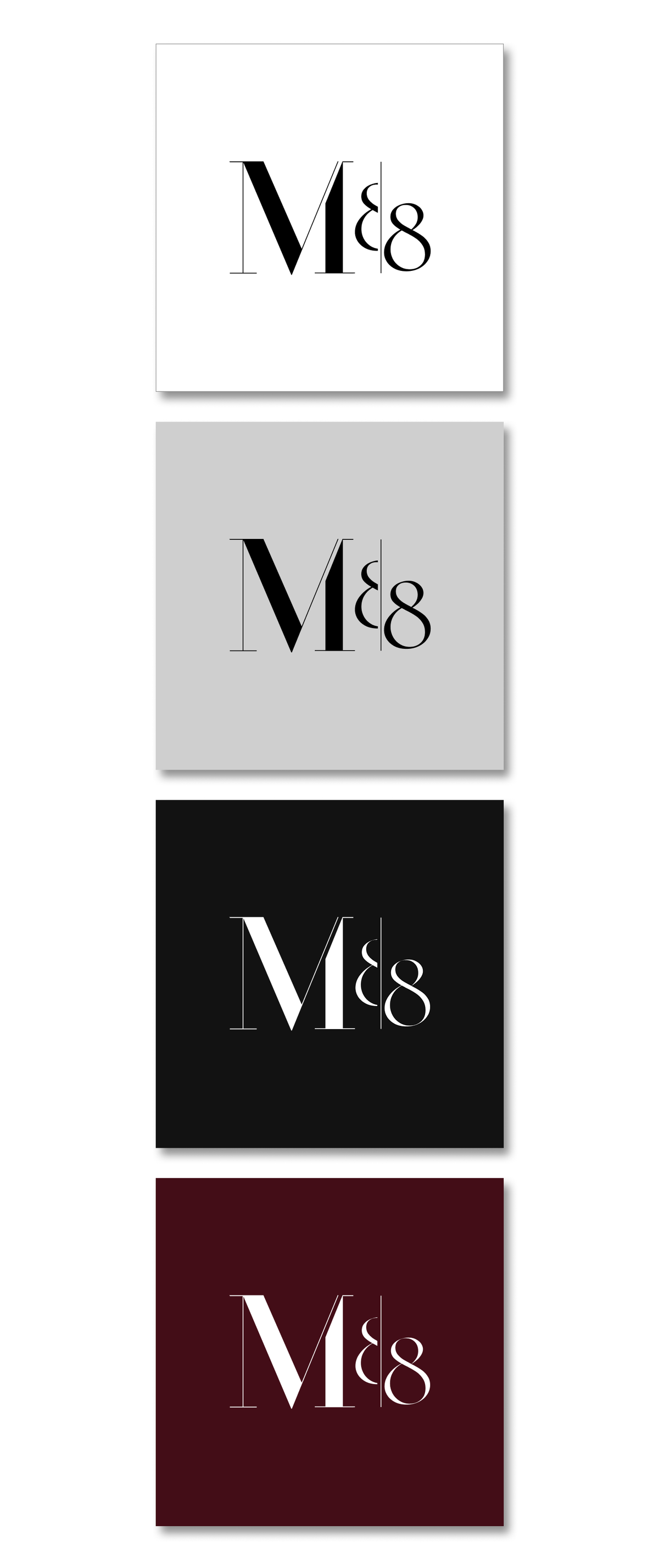
And here’s the thing: there’s no single correct answer. The first option is about emotion and status, the second is about legibility and scalability. A good logo always lives at the intersection of aesthetics and business needs, and the final call depends on where and how the brand will most often be seen: on a storefront, on social media, on a business card, or in ads.
We always give the client arguments, not our own taste imposed on them. Because a logo isn't about ‘what looks pretty to me’ — it's about how the brand will work for years.
What other options there were:
Classic with character
A strict, elongated M88 monogram with thin serifs — reads as architectural graphics. There’s a sense of order, precision, and premium quality here: a logo that carries experience and confidence. Perfect for an audience that values polish and ‘expensive’ restraint.
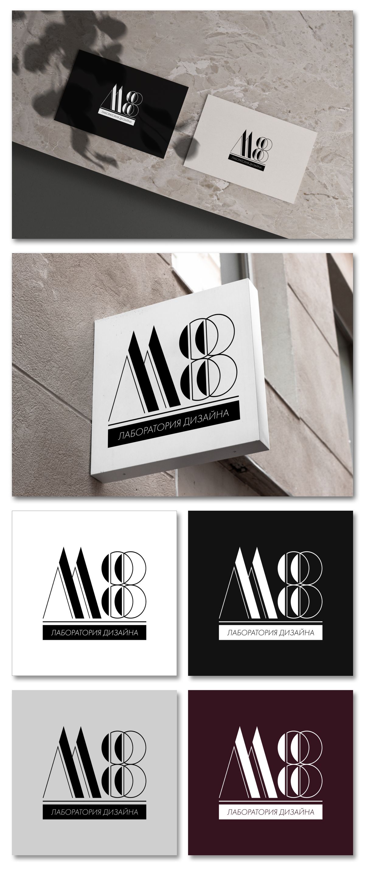
Bold modern
A dense, rounded, almost ‘digital’ mark — the most dynamic of them all. It reads as a modern, tech-forward studio unafraid of experiments. Energy, confidence, forward motion — this option speaks the loudest on signage and social media.
Refined elegance
A light, airy monogram with a calligraphic flourish around the letter M. The most feminine and ‘interior-design’-feeling of the three: it has grace, taste, and a sense of comfort. This mark speaks of delicate work with space and attention to detail — exactly what people expect from an interior designer.
The final brand book: M88 · Design Lab
In the final version, we built the branding around a refined M88 monogram — a mark where a strict, architectural letter M meets an elegant calligraphic flourish. It's a precise match for the brand's essence: a design lab where engineering precision meets aesthetics and taste.
Typefaces. The foundation is two contrasting grotesques with character: Bodoni Moda for the logotype — with high-contrast strokes and a ‘fashion-forward’ feel, like a glossy-magazine cover, and Oranienbaum for headings — elegant, elongated, with an aristocratic strictness. Together they set a premium tone and instantly read as ‘expensive design.’
Color palette. A deep burgundy-wine shade as the main accent, paired with graphite black, light grey, and pure white. It’s a restrained, refined palette: the wine tone adds warmth and status, while the monochrome keeps things elegant without distracting from the studio’s work.
Brand patterns. We developed several patterns based on the mark’s geometry and elements: thin Art-Deco-style line ornaments, a rhythmic repeat of the figure ‘8,’ and a text pattern made from the name ‘Design Lab.’ They give the brand flexibility — from packaging and business cards to signage and social media — while keeping it recognizable on any surface.
Applications. The logo and mark are worked out in three versions — on white, black, and the brand’s signature wine background — so the brand looks equally confident on a business card, on a storefront, and in digital.
The result — a cohesive, elegant identity that conveys the main thing: this is a studio where design is created thoughtfully, with taste and attention to detail.

So which option is closer to you? Tell us in the comments 👇
Want a logo and brand book for your own project? Get in touch — let's talk through your brief.
Contact the author
Comments
No comments yet — be the first.